





 Shopify
 Stripe
 Slack
Slack Notion
 Google Workspace
 Confluence

How Do You Visualize Support Ticket Data? Macha's Studies Report View


Help desk reports chart ticket metadata like status and channel, but not what the tickets are about. Macha's Studies Report view charts the answers an AI extracted from each ticket, with a click-through to the tickets behind every bar.
Key takeaways
- Macha's Studies Report view builds bar charts for Yes/No and choice columns and histograms for Number columns, with no manual chart setup after a Study run completes.
- In a real 57-ticket Studies run, the Billing related column split 34 No (60%) and 23 Yes (40%), and the run showed 0 errors.
- The Urgency column in that run averaged 2.04 on a 1 to 5 scale, yet the histogram showed an 11% tail of tickets at level 5.
- Macha's histogram gives each value its own bin when a Number column has 10 or fewer unique values, and bins wider ranges into roughly 10 equal-width ranges.
- Studies and the Report view come with every Macha plan, which starts at $299 a month for 750 tickets, and also run on the free trial.

Macha's Studies Report view turns an AI analysis of your support tickets into charts automatically: Yes/No and choice columns become bar charts with count and percentage, Number columns become histograms with min, mean, median and max, and clicking any bar opens the exact tickets behind it. On a real 57-ticket run it showed that 40% of tickets touched billing and 11% scored the top urgency level, numbers your help desk's own reports can't produce because nobody ever tagged them.
| Schema column type | How the Report shows it | Drill-down |
|---|---|---|
| Yes / No, single choice, multiple choice | Bar chart: bucket label, count, percentage | Click a bar to open the matching tickets |
| Number | Histogram plus min, mean, median, max | Click a bin to open the matching tickets |
| Short text, long text | No chart (free text doesn't tally) | Read it in the results grid |
Which chart answers which question?
The right chart depends on the question you're asking of the data:
| If you want to know… | Reach for a… |
|---|---|
| How tickets split across categories (billing vs shipping vs returns) | bar chart, one bar per category, sized by count |
| The distribution of a number (urgency score, reply time, order value) | histogram, bars over numeric ranges, showing the spread |
| How a count or rate moves over time | line chart |
| The rough proportion of a few buckets | pie or donut |
Two of these, bar charts and histograms, answer the bulk of the questions a support leader actually asks of a ticket backlog: how does the work break down, and how is this score distributed. The other thing to know is where the data comes from. Most help-desk reporting, Zendesk Explore, Freshdesk Analytics, charts the metadata the system already records: status, channel, priority, assigned agent. What it can't chart is the content of the ticket, because "this is a billing complaint" or "this one is genuinely urgent" were never fields anyone filled in. Closing that gap is exactly what Macha's Studies Report view does.
The Report view, which shipped on June 5, 2026, builds those charts for you. The moment a Study finishes reading your tickets, every completed run carries a Report you open straight from the run toolbar. It reads your schema, decides how each column should be summarised, and renders the answer: bar charts for the categorical columns, histograms for the numeric ones, summary stats up top, and a click-through drill-down from any chart back into the exact tickets behind it. The data isn't ticket metadata; it's whatever you taught the AI to extract.
Every number below comes from a real run I did on our test Zendesk: 57 tickets, four columns. Nothing is a mockup.
Why does Studies need a separate Report view?
The Studies results grid is built for inspection: one row per ticket, sortable columns, a search box, click into any row to read the full ticket behind the AI's answer. That's the right tool when you're validating the model's judgment or chasing a specific record.
But inspection doesn't answer portfolio questions. To know that 40% of this window touched billing you'd have to count a Yes/No column by hand; to know the shape of an urgency score you'd have to build a pivot. The Report view exists so you never open a spreadsheet for that. It treats each schema column as a thing to aggregate, picks the chart that fits the column's type, and lets you go straight from a bar back to the rows it represents.
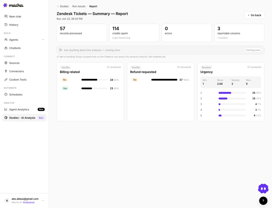
You open it from the toolbar on any completed run. Across the top sit stat callouts that summarise the run itself, records processed, credits spent, errors. Below them, one aggregation card per reportable column, each rendering the chart that matches the column's answer type.
What do the stat callouts show?
Before any column chart, the Report leads with the health of the run. For mine the callouts read 57 records, 114 credits, 0 errors: records processed, the usage meter the Study run page displays, and the error count. Those are the three numbers you want before you trust anything downstream of them. A run with a meaningful error count is a run whose percentages you should read with suspicion, so surfacing it at the top is deliberate: it's the denominator-integrity check that keeps the charts honest.
Which columns become bar charts?
Any column whose answers fall into discrete buckets becomes a bar chart. That covers three of Macha's schema types:
- Yes / No, true-false flags (is this billing-related?)
- Single choice, the model picks one from a fixed list (category: shipping, returns, technical…)
- Multiple choice, the model can pick several
Each bar carries three labels: the bucket name, the count, and the percentage of the run. No mental arithmetic, no hovering for a tooltip to find out what 23 out of 57 actually means.
Here's what two of my columns produced:
| Column | Buckets |
|---|---|
| Billing related | No 34 (60%) · Yes 23 (40%) |
| Refund requested | No 57 (100%) · Yes 0 |
Both bars tell an operator something immediately. Billing is a big slice: 40% of a month's tickets touched payments, invoices, or charges, which is a strong signal that a billing-capable agent (or a Stripe connection) would earn its keep. And not a single ticket in this window was an outright refund request, so a refund-automation flow would sit idle here. Two charts, two build decisions you'd otherwise make on gut feel.
The percentage on every bar is what makes the chart portable: "40%" survives being pasted into a planning doc in a way that "23" never does.
How are Number columns charted?
Numeric columns get different treatment, because the question for a number isn't which bucket; it's what's the distribution. So a Number column renders as a histogram, preceded by four summary stats: min, mean, median, and max.
My Urgency column (the AI scored each ticket 1–5) came back:
| Stat | Value |
|---|---|
| Min | 1 |
| Mean | 2.04 |
| Median | 2 |
| Max | 5 |
And the histogram underneath:
| Urgency | Count | Share |
|---|---|---|
| 1 | 26 | 46% |
| 2 | 18 | 32% |
| 3 | 4 | 7% |
| 4 | 3 | 5% |
| 5 | 6 | 11% |
The summary stats alone would mislead you. A mean of 2.04 reads as a calm queue, but the histogram shows a real 11% tail at level 5, the genuinely urgent tickets you'd want routed fast. The distribution is the insight; the average hides it. That's exactly why the Report shows both.
How does the histogram pick its bins?
The histogram is smart about how it buckets, which matters once your numbers aren't a tidy 1–5 scale:
- ≤ 10 unique numeric values → each distinct value becomes its own bin. My urgency scores (just 1 through 5) each get a clean, exact bar, no smearing.
- More than 10 unique values → Macha auto-bins into roughly 10 equal-width ranges. A "minutes to first reply" or "order value" column with hundreds of distinct numbers becomes a readable ten-bar shape instead of an unusable forest of one-record spikes.
You don't configure any of this; the Report inspects the column and picks. It's the difference between a histogram that's instantly legible and one you'd have to rebuild in a notebook.
How do you get from a bar back to the tickets?
This is the part that turns charts from a dead-end into a workflow. Click any bar and the Report opens a modal listing the matching records, and that modal is the same results table the main run page uses. Sort it, search it, click into any row to read the full ticket behind the AI's answer.
So the loop is: see that 23 tickets are billing-related → click the bar → read those 23 tickets in the familiar grid, without re-filtering anything by hand. Because it's the identical table component, navigating from a chart into the rows feels continuous rather than like a context switch into a different screen.
That continuity is the whole point of a drill-down: it lets you answer the follow-up question, which ones, exactly?, the instant the chart raises it, which is precisely where static dashboards leave you stranded.
Can you ask the Report questions in plain language?
At the top of every Report sits a wide input bar for asking free-form questions about the run, and right now it's deliberately disabled, marked "Coming soon." Study-scoped query tools are on the way: once they land, you'll be able to ask Macha's Sidekick natural-language questions about a run's data and it'll answer using the run's actual results.
Until then the input stays inert by design, Macha would rather show you the feature is coming than wire up a box that returns confident, ungrounded answers. It's a small thing, but it's the right call: a Q&A bar that hallucinates over your support data is worse than no bar at all.
Where does the Report view fall short?
No feature is free of trade-offs, and it's worth being straight about this one's edges:
- It runs on your usage. Macha now sells one plan priced on ticket volume, from $299 a month for 750 tickets, with every feature included on every tier. Studies and the Report also run on the free trial, drawing on its $50 of usage. (Details on the pricing page.)
- Only typed columns aggregate. A Short text or Long text column, a one-line summary, say, has no meaningful chart, so the value of the Report depends entirely on how you designed your schema. If you want a billing breakdown, you need a Yes/No or choice column for it; free text won't tally. The chart quality is decided back in the Extract step, not here.
- The charts inherit the AI's judgment. A bar reading "40% billing" is only as right as the model's per-ticket calls. The drill-down exists partly so you can spot-check that, click the bar, read a handful of the rows, confirm the label is sound before you quote the percentage in a planning deck.
- A run is a frozen snapshot. The Report reflects the records and model from that run; it doesn't live-update as new tickets arrive. To measure change over time you run the same Study over two date ranges and compare the two Reports, which is a feature, not a bug, but worth knowing.
For a deeper look at how Studies fits alongside Macha's live agents (the AI layer on top of Zendesk, Freshdesk, Gorgias, Front, HubSpot or Intercom, not a replacement for it), the Studies walkthrough covers the full Source → Scope → Extract → Review build.
How does the Report view compare to your help desk's built-in reporting?
Tools like Zendesk Explore already chart tickets by status, channel, priority, or agent, the metadata the helpdesk records. The Report view charts something different: the answers an AI extracted by reading the ticket content. Your helpdesk can tell you 57 tickets came in on email last week; it can't tell you 40% of them were about billing and 11% were genuinely urgent, because "billing" and "urgent" were never fields anyone filled in. The Report visualizes the structure you create with a Study, which is exactly the structure consistent tagging never gave you. The two are complementary: helpdesk analytics for operational metrics, Studies Reports for the semantic shape of what customers are actually saying.
FAQ
How do I open the Report view? Click View report in the toolbar on any completed Study run page. Every finished run has one.
Which columns become charts? Typed categorical columns, Yes/No, single choice, multiple choice, render as bar charts with label, count, and percentage. Number columns render as histograms with min/mean/median/max stats. Free-text columns don't aggregate into a chart.
How does the histogram decide its bins? If a number column has 10 or fewer unique values, each value gets its own bar. With more than 10 unique values, Macha automatically bins into roughly 10 equal-width ranges so the shape stays readable.
Can I see the actual tickets behind a chart? Yes, click any bar to drill into the matching records in a modal that uses the same sortable, searchable results table as the main run page.
Can I ask the report questions in plain language? Not yet. An "Ask Sidekick" bar is shown as a disabled "Coming soon" preview; study-scoped Q&A is on the roadmap. The input is intentionally inert until it can answer from the run's real data.
Which plans include the Report view? Every plan, and the free trial. Macha has one plan priced on ticket volume, starting at $299 a month for 750 tickets, with every feature on every tier. Studies also run on the free trial. See the pricing page.
How do you try the Report view?
If you've run a Study and only ever looked at the grid, you've seen half the feature. Open the Report on a completed run and the queue's shape, the billing slice, the urgency tail, the category that quietly dominates, shows up in one screen, with the tickets behind it one click away. You can start a free trial ($50 of usage, no credit card, no time limit) to connect your help desk, try agents, and run a Study with its Report. The Studies docs cover the full walkthrough.
Written by Abbas (Customer Support & AI, Macha) · Reviewed by Ankeet Guha (Co-founder & CTO) · Published 2026-06-24 · Last updated 2026-09-24.