





 Shopify
 Stripe
 Slack
Slack Notion
 Google Workspace
 Confluence

What Changed in the New Front Redesign, and How Do You Cope? (2026)


Front's redesign, mandatory since 5 August 2025, added clicks to everyday actions, weakened dark-mode contrast and removed the thread message counter, with no toggle back to the old layout. Light mode, keyboard shortcuts and pinned views take most of the sting out.
Key takeaways
- The new Front became the only layout on 5 August 2025, moving search into a popover and removing the thread message counter, with no official toggle back to the old interface.
- Front staff wrote on 29 July 2025 that it had no plans to act on the color feedback because users typically take a few weeks to adjust.
- Front lists Starter at $25, Professional at $65 and Enterprise at $105 per seat a month billed annually, with Copilot and Smart QA at $20 a seat each on lower plans.
- Front Autopilot charges per conversation at the highest outcome reached: $0.05 for triage, $0.39 for a handoff and $0.89 for a resolution.
- A five-seat Front team on Professional pays $325 a month in seats, rising to $525 once Copilot and Smart QA are added for every seat.

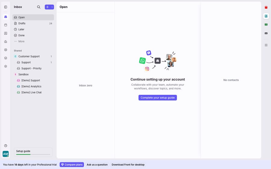
The new Front, announced on 15 July 2025 and made the only layout on 5 August 2025, moved search into a popover, shrank the compose button to an unlabeled icon, tucked calendar, settings and analytics into dropdowns, and dropped the counter showing how many messages sit in a thread. There is still no official toggle back to the old interface. The fixes that help most are switching away from dark mode, learning keyboard shortcuts and pinning the views your team uses.
| What changed | What users reported | Workaround |
|---|---|---|
| Search moved into a popover | An extra click to search | Keyboard shortcut (press ? for the list) |
| Compose became a small unlabeled icon | An extra step to start an email | Keyboard shortcut |
| Calendar, settings, analytics moved into dropdowns | Buried navigation | Pin the inboxes and views you use |
| Thread message counter removed | Hard to tell new issues from ongoing ones | Triage by Open/Later/Done status |
| New dark-mode palette | Weak contrast, read and unread look alike | Switch to the light or system theme |
What actually changed in the new Front?
The redesign reworks the inbox chrome (the rails, buttons and indicators around your conversations) rather than how shared inboxes work. In Front's own announcement of the all-new Front, posted 15 July 2025, the company framed it as "a reimagined inbox to boost productivity and focus," paired with tighter AI integration. The legacy layout stayed available until 5 August 2025, then the new one became mandatory.
The visible shifts most people notice first:
- Search moved into a popover. The persistent search bar was replaced with a pop-out, which one user noted sits away from "the location that every other business application uses."
- The compose button shrank and lost its label. What used to be a clear, labeled "Compose" is now a smaller unlabeled icon.
- Calendar, settings and analytics were tucked into dropdowns instead of living as always-visible icons in the rail.
- The thread message counter was removed. That's the small number that told you how many emails were in a conversation at a glance.
- Categories and inbox sections were combined, changing how you scan Open, Drafts, Later and Done.
None of these break functionality. Together, though, they change the muscle memory of a tool support teams sit in for eight hours a day, which is why the response was so sharp.
If you're new to the platform and want the fundamentals rather than the redesign specifics, our what is Front app primer and the Front shared inbox model explain how the core product is meant to work.
Why do users dislike the new Front?
The most-cited community thread on the change, New Front Update: Opinions, opened on 16 July 2025 and reads as a fairly unanimous set of frustrations. Three themes dominate.
More clicks for the same actions. Search is now a popover instead of one click, compose takes an extra step, and tagging an email means clicking a plus sign or reaching for a shortcut. Each one is tiny. Multiplied across hundreds of conversations a day, users describe it as a productivity tax rather than a cosmetic annoyance.
Dark-mode contrast that's hard to read. This is the sharpest criticism. One user wrote that "the contrast ratio is even worst than what it used to be, making things harder to read," and another said the "sidebars, chat and inbox are just one big blur." Users report that telling read from unread emails got harder in dark mode, and that's the exact signal a shared inbox depends on.
Removed signals that carried real information. The thread counter is the most-missed casualty. As one user put it, with no counter "it's impossible to tell what are new issues vs ongoing issues." Object titles and linked URLs were also condensed into collapsed icons, hiding context that used to be visible.
Front's response was candid but unsatisfying to many. A Front support specialist acknowledged the feedback on 21 July 2025, listing dark-mode contrast and object titles among the items the team would look at. On 29 July another Front team member wrote that "we don't have plans to address this type of feedback as we've seen that it typically takes users a few weeks to adjust." There is still no official toggle to restore the old interface, which is the change most users in the thread asked for.
Keep proportion here. This is a chrome-and-contrast redesign, not a data-loss or reliability event: your conversations, rules and integrations still work. But in a tool where scanning speed is the value, ergonomics aren't a minor concern.
Which settings and workarounds help?
There's no "old UI" switch, but several adjustments take the edge off:
- Switch to light mode (or system) if dark mode is unreadable. The contrast complaints are worst in dark mode, and many users find the light or auto theme clearer. You'll find it in your appearance settings.
- Learn the keyboard shortcuts. The extra clicks hurt most if you're mousing. Compose, search, tag, assign, archive and snooze all have shortcuts, and pressing
?in Front shows the full list. This does more for the click-count complaint than anything else. - Pin what you use. Because calendar, analytics and settings moved into dropdowns, spend ten minutes reordering and pinning the inboxes and views your team opens, so the important rails aren't buried.
- Triage by status instead of the missing counter. With the thread counter gone, lean on Open, Later and Done sections and unread styling (clearer in light mode).
- File specific feedback. Front iterates in public, and reproducible feedback in the community threads is more likely to shape later changes than a general complaint.
For a fuller picture of the product beyond this one release, our Front app review weighs the strengths and the recurring gripes across the platform.
How much does Front cost after the redesign?
The redesign shipped alongside Front's push into AI, which is why "the new update made things worse and the AI costs extra" shows up in the same breath online. Front's pricing page lists three plans, priced per seat and shown billed annually (monthly billing costs about 24% more):
| Plan | Price (per seat/mo, annual) | Fits |
|---|---|---|
| Starter | $25 | Small teams, up to 10 seats |
| Professional | $65 | Growing teams needing advanced automation and analytics, up to 50 seats |
| Enterprise | $105 | Larger orgs; Copilot, Smart QA and Smart CSAT included |
The sticker price is only part of the story. On Starter and Professional, Copilot and Smart QA are $20 a seat a month each, and Smart CSAT is $10. Autopilot, Front's AI agent, is billed per conversation at the highest outcome reached: $0.05 for triage, $0.39 for a handoff and $0.89 for a resolution, per Front's Autopilot help article. Run the arithmetic for a five-seat team on Professional: $325 a month in seats, and $525 once Copilot and Smart QA are added for everyone, before a single Autopilot charge. G2 reviewers echo the pattern (and the breakdowns from Featurebase and Hiver say the same): collaboration and ease of use get praise, while per-seat cost plus stacked AI add-ons is the most common knock.
We keep a full teardown in Front pricing explained. The point for this article: a redesign that added friction, while the AI you'd want stays a per-seat surcharge, is fair for buyers to weigh together.
Can you add AI to Front without leaving it?
Most of the redesign pain is about doing the work faster inside the inbox. The UI debate skips a second lever: doing less of the work by hand at all. That's where an AI agent layer fits, and it doesn't require leaving Front.
AI agents for customer service exist to handle the repetitive, answerable conversations that never needed a human to read them. Macha is one such layer. It runs on top of the Front you already use through the live Macha–Front connector, and it doesn't replace your inbox, your teammates or your rules. Front keeps routing and collaborating; Macha's agent reads an incoming conversation, works out the intent, and drafts or sends a grounded reply, pulling a real order or account status through a custom tool that turns your REST API into something the agent can call.
The pricing difference is worth naming. Front charges per seat for Copilot and per outcome for Autopilot, which means the Autopilot bill rises with how many conversations it touches and how you define an outcome. Macha bills per ticket: one conversation, charged once however many messages it takes, starting at $299 a month for up to 750 tickets, with setup and monitoring by the Macha team included. The cost tracks the volume you handle rather than the size of your team. If you want the mechanics of Front's own AI first, Front AI explained covers Copilot, Smart QA and Autopilot in detail.
If the redesign genuinely broke your team's workflow, it's reasonable to look around; our best Front alternatives roundup is an honest comparison. For most teams already invested in Front, though, the practical move is to soften the UI change with the settings above and add an agent on top for the volume, rather than migrate.
FAQ
Can I switch back to the old Front interface? No. The legacy layout was available until 5 August 2025, and Front hasn't shipped a toggle to restore it since, even though that was the most-requested change in the community thread.
Why is the new Front so hard to read in dark mode? Users report the redesigned dark theme has weaker contrast, described as "one big blur," which makes read and unread emails hard to tell apart. Switching to the light or system theme is the most common workaround.
What happened to the thread message counter? The redesign removed the counter showing how many messages a conversation contained. There's no setting to restore it; the practical workaround is to triage by Open, Later and Done status and unread styling instead.
What does Front cost now? Front lists Starter at $25, Professional at $65 and Enterprise at $105 per seat a month, billed annually. Copilot and Smart QA are $20 a seat each on the lower plans, and Autopilot charges up to $0.89 per resolved conversation, so total cost climbs faster than the base plan suggests.
Can I add AI to Front without switching tools? Yes. An AI agent layer like Macha connects to Front as a live connector and runs on top of your existing inboxes. Your team keeps working in Front; the agent reads incoming conversations and drafts or sends grounded replies for the ones that don't need a human.
Want to take volume off your team while you adjust to the redesign? Start a free trial of Macha and connect it to your Front in minutes.